

Poll: Which abandoned Android phone features do you miss the most?
-
This post did not contain any content.
The triangle / circle / square (or back / home / app tray) navigation system.
I've had to re-enable it on my last phones because they come with the much less usable new gesture navigation, and I dread the day it's not an option anymore.
The classic app drawer.
If I wanted an iPhone (with their cluttered, unusable, and extremely user hostile design) I'd get an iPhone.
I don't want my screen cluttered with random icons, I want multiple sliding screens with widgets for the apps I need to be able to check at a glance, with a row of quick access apps / app folders at the bottom (slidable and hidable if possible), with an icon to access the list of less used apps on the top right, where it used to be back when android was useable instead of a cheap iOS clone.
Luckily third party launchers are still a thing.
-
Only the optical sensors do this. The newer ultrasonic fingerprint sensors are more accurate and don't require any light/brightness changes.
So I've heard! My 6 has the light, and while I've gotten accustomed to it, I'm not a fan.
-
This post did not contain any content.
Control over it.
-
I liked the little led light at the top that would blink for notification
And you could customize the color depending on the message/notification!
-
This post did not contain any content.
At this point I am team "use phones less, use Linux PCs more" unless I am away from home.
I'm just chilling on my couch with my family. Having a nice ergo trackball and a monitor on an arm that can swing out in front of me is a game changer.
-
Human coded Smart Keyboard. Ever since they changed to learning algorithms the spelling and grammar corrections have gotten much worse.
I straight up turn the autocorrect off wntirely these days. Natural rypos are so much easier to read than autocorrect switching out entire damn wprds...
(leaving in typos for example)
-
OnePlus still offers this one on some of their phones.
Can confirm. Currently rocking a OnePlus 12 with an IR blaster. Only sucky part is the app doesn't let you put in custom codes or tweak the layout, so one of the old TVs I have set up doesn't have a freaking number pad. Suuuper annoying to not have a number pad with digital channels.
-
While I fully sympathise and agree, most android phones have a camera shortcut that doesnt need you to unlock with fingerprint. just swipe up the camera icon usually bottom right on lock screen
My shortcut is to double-tap the power button. Works to bypass the lock screen for the camera, though going anywhere else including the gallery then asks for a fingerprint or pattern/etc.
-
I liked the little led light at the top that would blink for notification
I don't remember which phone, but one of mine had an rgb led that could be set to blink different colors for different apps. I really miss that!
-
I straight up turn the autocorrect off wntirely these days. Natural rypos are so much easier to read than autocorrect switching out entire damn wprds...
(leaving in typos for example)
Hmm interesting i may do that
-
This post did not contain any content.
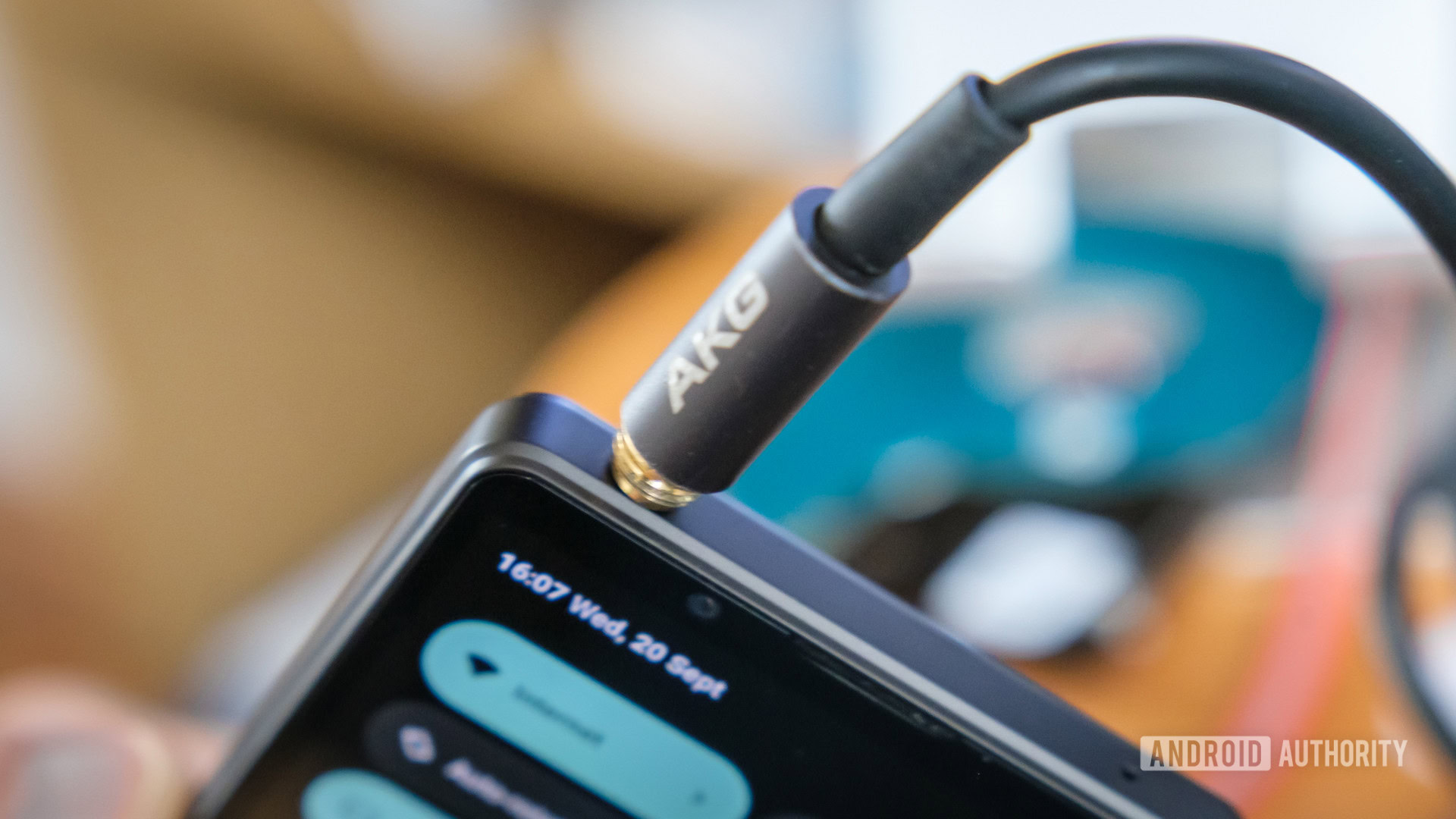
no headphone jack is shitty but god i fucking loathe typing on a touchscreen keyboard
-
On the side isn't good enough?
Their preference was the back. So no.
-
Blinking LED when I got a text
I miss my Google Nexus 5
-
USB mass storage mode. Some Android phones can’t do it anymore. I always thought the ability to select a disk image your phone would offer up to a of to boot off of was the coolest feature one of the things that made this iPhone user envious but it’s becoming less common for such a feature to still work in Android.
Mass storage is a block level protocol, phone can't also use the storage while mounted via mass storage. This required a dedicated storage volume on the phone that could be locked to apps while connected by USB.
MTP (media transfer protocol) is a file level protocol, like a shared folder, that doesn't lock the storage for exclusive use. Phones use this now.
-
no headphone jack is shitty but god i fucking loathe typing on a touchscreen keyboard
They keep getting worse, too. I loved my Galaxy Relay. I bought a Moto Z because someone was making a keyboard backplate for it... And they killed off the project a few months later.
The only thing worse than the on screen keyboard is Blackberry's physical keyboard. Give me some kind of slider.
-
This post did not contain any content.
Non-pastel colors. My phone used to be fire orange on black and i loved it!
Really just personalization in general.
-
This post did not contain any content.wrote last edited by [email protected]
None, I buy Motorola. Still have all the features.
-
no headphone jack is shitty but god i fucking loathe typing on a touchscreen keyboard
My first Android phone was Motorola Dext, second one was HTC Desire Z, which I held on to for a long time. By the time I had to replace it, there were no slide-out keyboard phones any more.
Then some time later F(x)tek X1 Pro was released. Looked like a perfect phone for me, but was too expensive, so I did not get it. But now that it's time is over as well, I look at the reviews and see that I did not miss much.
So now I am sadly on a glassy rectangle like everyone else, but I do carry a collapsable bluetooth keyboard around with me sometimes, so that I can still type some longer text in a proper way.Also, I solved my no-headphone-jack issue by getting USB-C headphones. And there are USB-C to 3.5 jack adapters if you need to connect existing headphones or other equipment. So I don't really get how this "I miss a hole" is everywhere and lasts for so long.
-
This post did not contain any content.
The core apps (like messaging, and calendar) being free software and open source.
-
The triangle / circle / square (or back / home / app tray) navigation system.
I've had to re-enable it on my last phones because they come with the much less usable new gesture navigation, and I dread the day it's not an option anymore.
The classic app drawer.
If I wanted an iPhone (with their cluttered, unusable, and extremely user hostile design) I'd get an iPhone.
I don't want my screen cluttered with random icons, I want multiple sliding screens with widgets for the apps I need to be able to check at a glance, with a row of quick access apps / app folders at the bottom (slidable and hidable if possible), with an icon to access the list of less used apps on the top right, where it used to be back when android was useable instead of a cheap iOS clone.
Luckily third party launchers are still a thing.
Neither of these were abandoned