

Not expensive enough

-
This post did not contain any content.
-
 T [email protected] shared this topic
-
[email protected]replied to [email protected] last edited by
Lost opportunity to rebrand to ClosedAI
-
[email protected]replied to [email protected] last edited by
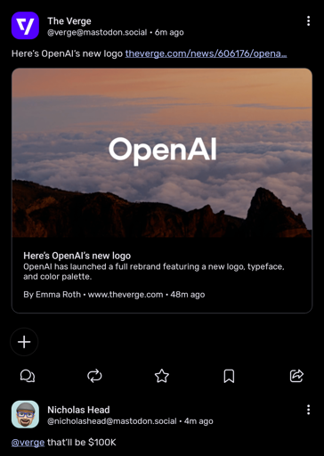
The clouds are smoke from all the money they burned. The mountains are where they’re building a trillion dollars in power plants to power their bloated, hallucinating nonsense.
Imagine what might have happened if OpenAI stayed a non-profit and worked on cost-effective R&D instead of chasing hype and dumb money investors with a rushed product.
-
[email protected]replied to [email protected] last edited by
That's not a logo; That's a font
-
[email protected]replied to [email protected] last edited by
Maybe the clouds and the landscape is part of the logo? I'm reaching for straws here, because this logo sucks.
-
[email protected]replied to [email protected] last edited by
That's not a logo either; It's a photograph
-
[email protected]replied to [email protected] last edited by
Their logo is just basic text of the name of their company? Creative...
-
[email protected]replied to [email protected] last edited by
That’s their new font. This is the new logo:

(Yes it is almost exactly the same as the old one)
-
[email protected]replied to [email protected] last edited by
With all that "creative" powered ai, you'd think they could do a mite better.
-
[email protected]replied to [email protected] last edited by
You only indulge in this sort of faff if you are having an existential crisis.
-
[email protected]replied to [email protected] last edited by
Billions upon billions of research were poured into Sans-serif.