

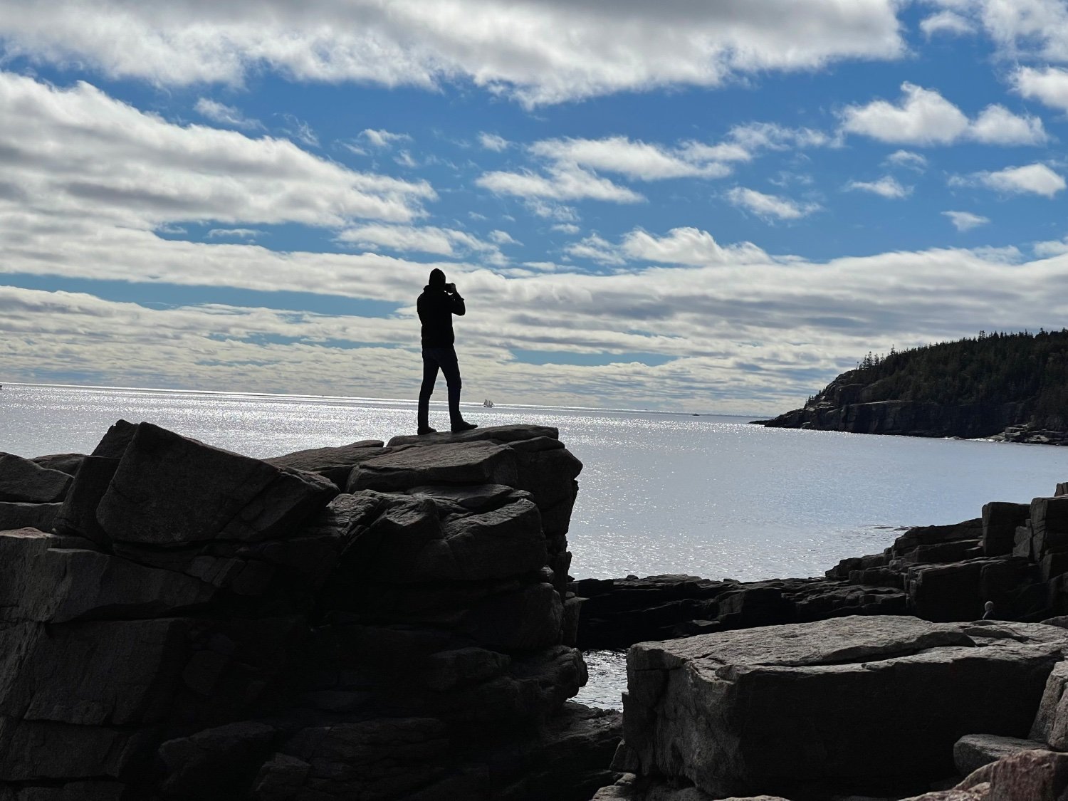
[OC] This is probably the best photo I've ever taken
-
Overall nice photo. Good capture of the sky.


I would bright up the shadows a bit and rotate it slightly to make the horizon flat to improve it a bit more.
-
I suck, so I only get the spur-of-the-moment shots.
This is one of my latest favorites. Window prisms hit just right, zero adjustment.
-
Then the subject is falling backwards. Plus, the tilt focuses the subject's view to the lower right. Lends action, what is he looking at? PLUS, levelling the horizon reduces the subject's importance.
(Jesus, I sound like an art critic. But hell, I think the pic is near perfect.)
-
because it feels off balance.
the level of the horizon is a key part of composition. it effects comfort, balance, and groundedness. when the horizon is not level it will feel disorienting, dizzy, or chaotic. yes, you can break compositional rules for artistic effect, but you need to learn the rules and why they matter before you can do so effectively. the example you posted below doesn't really make your case. it's not that great of a photo, rotated or not. to intentionally rotate the horizon to give it an uncomfortable or disorienting feeling is fine if that's the goal hell, maybe it's more to feel otherworldly or any other number of things you can derive from it. the point is that you need a reason and intent behind the unlevel horizon. what feeling were you trying to invoke by not having the ground beneath the feet of the viewer?
-
it is not. a tilted horizon is never acceptable regardless of whatever else is going on in the photo. However the subject was standing with a flat horizon is authentic.
-
As others have said, a really easy improvement is to straighten that horizon up so all the water doesn't tip out.
-
If the photo's content is such user would be inclined to rotate the photo back to level in their mind, then there is no justifiable reason to have an off-level horizon. In this example, there is no content in the photo that makes tilting it "add" anything to the composition. It's especially bad when the horizon is the sea. This photo is not enhanced in any way by tilting the horizon. It makes it neither artistic nor cool.
Instead, the content of the photo should complement the rotation, such as:
https://external-content.duckduckgo.com/iu/?u=https%3A%2F%2Flive.staticflickr.com%2F5183%2F5655282338_d82f1db546_b.jpg&f=1&nofb=1&ipt=da6c2075b699cd1e651b1aa725dda962a623a3ac25e528f28ed597496fa1c604&ipo=images -
It makes it neither artistic nor cool.
being "artistic or cool" may be your goal, but they're not universal goals.
there is no justifiable reason to have an off-level horizon.
art doesn't need to justify.
Instead, the content of the photo should complement the rotation
that's an awful example. Not even mediocre 🤮
you see, de gustibus non est disputandum
-
yes, the example below is just a quick search and rotate on my phone. it's not "great".
what feeling were you trying to invoke by not having the ground beneath the feet of the viewer?
i wanted to transform lambda lemmings to art critics. I wanted to invoke an irresistible urge to comment
-
That is really cool! Seem to be doing good, hope you continue to enjoy it!
-